
Sacramento Regional Transit (SacRT) Case Study*
Year: 2021
Project Type: UI/UX Design
Institution Program: California State University, Sacramento
Site: Sacramento, CA
*Note: For more detailed information on each touchpoint, please read the formal Case Study
INTRODUCTION
This UI/UX design project focused on applying formative and summative research to identify user needs, evaluate existing experiences, and develop an effective, user-centered design solution. The project emphasized research-driven decision-making, conceptual development, interface exploration, and interaction design to improve the overall user experience.
For this project, I explored the experience of using the Sacramento Regional Transit District (SacRT), a local public transportation system. Drawing from my personal commuting experiences, I examined the challenges riders may encounter when navigating transit services, accessing information, and purchasing fares. These observations served as a starting point for identifying potential usability issues and opportunities for improvement.
Problem Areas
1) Safety and Privacy: Improving riders’ sense of safety and protecting their personal information, with particular consideration for the needs of marginalized and vulnerable communities.
2) Communication and Accessibility: Improving how SacRT communicates service alerts, schedule changes, transit updates, and other essential information to riders in a timely, clear, and accessible manner.
Design Goals
The primary goal was to improve the overall rider experience and strengthen engagement between SacRT and its users through a more intuitive, accessible, and user-centered digital experience. The project focused on three key objectives:
1) Enhance Privacy and Security: Build user trust by prioritizing the protection of personal information and promoting a greater sense of security throughout the transit experience.
2) Improve Communication: Make service alerts, schedule updates, and transit information easier to access, understand, and act upon.
3) Streamline the Fare-Purchasing Experience: Simplify the process of browsing fare options and purchasing tickets to create a more seamless and user-friendly experience.
01
RESEARCH & DISCOVERY
RESEARCH & DISCOVERY
Understanding the Rider Experience
As a long-time commuter, I am familiar with the frustrations of daily public transportation: early mornings, service delays, line closures, and overcrowded trains and buses. Despite these challenges, I recognize SacRT’s efforts to expand transportation options and serve communities throughout the Sacramento region. My personal experiences prompted me to look more closely at the rider journey and identify opportunities to improve how people interact with SacRT. Beyond the commute itself, I became particularly interested in how safety, communication, and accessibility influence a rider’s confidence in using public transportation.
Safety and Trust: Concerns about security, fare evasion, and fraud can affect how riders perceive the transit environment. These concerns present an opportunity to improve the rider experience through clearer safety information, accessible support resources, and stronger communication around privacy and security.
Communication and Reliability: Service delays and line closures are sometimes unavoidable, but uncertainty can be reduced through effective communication. Timely service alerts, clear instructions, and consistent updates can help riders understand disruptions, consider alternative routes, and make informed decisions throughout their journey. These initial observations established the direction for my research: understanding where friction occurs across the rider journey and exploring how a more cohesive, user-centered experience could make using SacRT easier and more reassuring.
Research & Exploration
I began by examining SacRT’s organizational identity, service offerings, and role within the Sacramento region. This exploration helped me understand the organization’s broader objectives, its relationship with the community, and the various touchpoints through which riders interact with its services.
I then explored opportunities to connect SacRT’s organizational identity with the practical needs of its riders. To organize these considerations, I developed a strategy workshop focused on evaluating the existing brand, identifying areas for improvement, and prioritizing design opportunities. To establish an initial visual direction, I created a mood board exploring color, typography, imagery, and visual references. This exercise helped define the intended look and feel of the experience and provided a visual foundation for developing a more consistent design system across digital and physical touchpoints.
02
KEY INSIGHTS & DESIGN OPPORTUNITIES
KEY INSIGHTS & DESIGN OPPORTUNITIES
Looking beyond individual interactions, I began considering the rider experience as a connected journey—from discovering SacRT and planning a trip to purchasing a fare, navigating stations, and receiving updates along the way. Three key areas emerged as opportunities for improvement:
1) Simplify Fare Purchasing
SacRT offers multiple ways to purchase tickets and passes, but navigating the available options can be challenging, particularly for first-time riders. A clearer purchasing experience could help users understand their choices, move through the transaction with greater confidence, and complete purchases with less friction.
2) Improve Communication and Wayfinding
Service updates, arrival information, and station signage play an important role in helping riders make decisions. Inconsistent communication or unclear directional information can create uncertainty, especially when disruptions occur or riders encounter unfamiliar environments.
3) Create a More Cohesive Experience
Riders interact with SacRT across a range of channels, including its website, mobile application, ticket kiosks, station signage, and promotional materials. A more consistent experience across these touchpoints could make information easier to recognize, improve usability, and reinforce familiarity with the service.
These opportunities shaped the central design challenge: How might SacRT create a more intuitive, consistent, and trustworthy experience that helps riders navigate the transit system, access essential information, and purchase fares with confidence?
03
UX STRATEGY & CUSTOMER JOURNEY
UX STRATEGY & CUSTOMER JOURNEY
For this course project, I was tasked with designing five touchpoints across the customer journey: Awareness, Planning, Waiting, Experience, and Follow-Up. Rather than treating each interaction as an isolated design problem, I used these stages to consider how riders discover, access, and experience SacRT’s services over time. Each touchpoint presented a distinct opportunity to address user needs while contributing to a more connected experience.
Design Strategy
1) Build Awareness Through a Social Media Campaign
Create engaging, informative content that introduces riders to SacRT’s services and explains how to navigate the transit system. The campaign aims to improve awareness, encourage exploration, and build familiarity with available transportation options.
2) Streamline Fare Purchasing Across Digital and Physical Channels
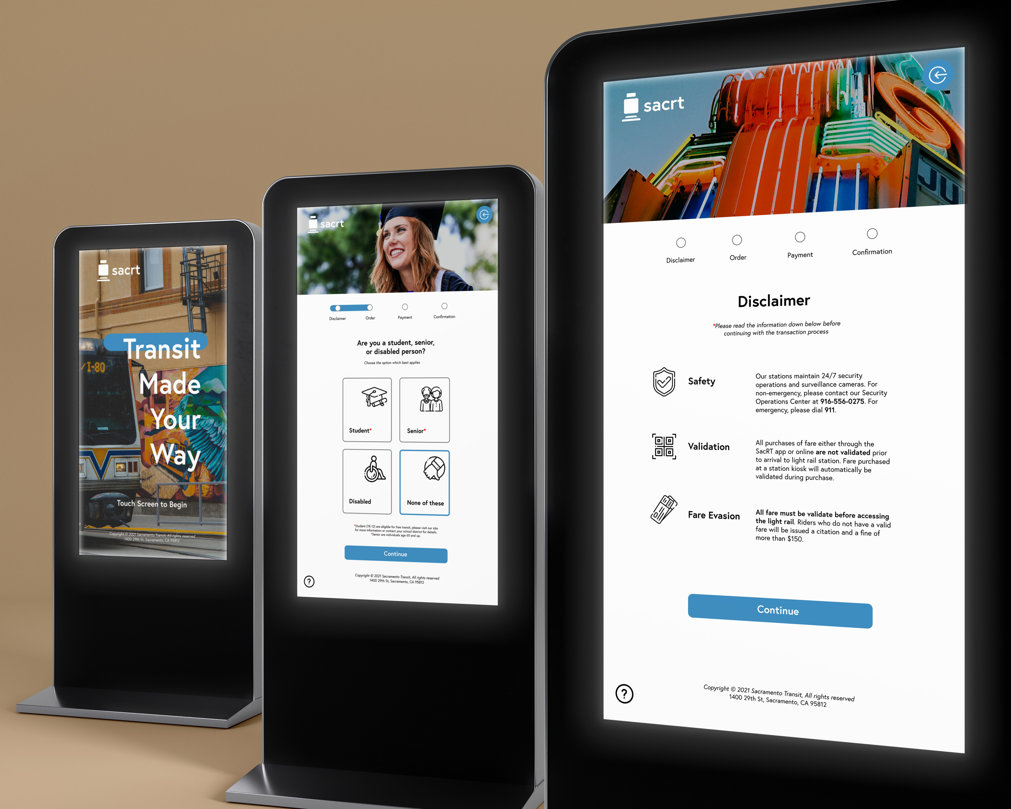
Redesign the website, mobile application, and ticket kiosk experience to make fare options easier to understand and transactions more intuitive. Consistent navigation, clearer information, and a more cohesive interface would help riders move between channels with greater confidence.
3) Introduce an Order Confirmation Email
Provide a clear confirmation after a successful fare purchase, including relevant transaction details and purchase information. This touchpoint reinforces communication, reduces uncertainty about transaction completion, and gives riders a reliable reference after purchasing.
4) Establish Clear and Consistent Station Signage
Develop a cohesive signage system that helps riders identify destinations, locate platforms, and understand their surroundings. Consistent visual cues and readable information aim to improve wayfinding and make stations easier to navigate.

04
VISUAL IDENTITY & DESIGN SYSTEM
VISUAL IDENTITY & DESIGN SYSTEM
Creating a Consistent Brand Experience
As I examined SacRT’s existing touchpoints, I identified an opportunity to strengthen its visual identity and create greater consistency across its digital and physical environments. SacRT serves a diverse regional community, with riders bringing different needs, levels of transit familiarity, and accessibility requirements to their journeys. Its visual language therefore needs to do more than establish a recognizable brand; it should also help people identify information, navigate interfaces, and understand what to expect across different interactions.
The proposed visual direction balances a modern, forward-looking identity with a more approachable and community-oriented personality. The goal was to develop a recognizable design system that communicates reliability, accessibility, and connection while supporting a consistent experience across the website, mobile application, ticket kiosks, station signage, and promotional materials.
Color Palette
The color system draws inspiration from SacRT’s existing light rail lines: yellow, green, and blue. Retaining these familiar colors creates a connection to the transit network while giving each color a defined role within the proposed visual identity.


Together, these colors establish a visual connection to the existing transit network while supporting a more unified brand experience. Their application should remain consistent across touchpoints, with sufficient contrast and additional visual cues to maintain accessibility and ensure that meaning is not communicated through color alone.
Typography
Because transit services rely on clear, often time-sensitive communication, typography plays an important role in the proposed design system. Riders should be able to quickly identify essential information, whether reviewing schedules, purchasing fares, or navigating a station.
I selected Europa, a contemporary sans-serif typeface, for its balance of geometric structure and humanist character. Its clean forms provide a modern visual presence while remaining versatile across headlines, interface labels, navigation, and supporting text. Europa supports the intended brand direction: modern yet approachable, structured yet welcoming. Combined with a consistent typographic hierarchy, it helps distinguish headings, supporting information, and primary actions. The typography system is intended to create a more predictable reading experience across digital interfaces and printed materials. By applying consistent type styles and clear hierarchy, the design aims to reduce visual clutter and help riders locate important information more efficiently.
05
DESIGN EXECUTION
DESIGN EXECUTION
The research, journey mapping, and visual exploration informed the development of four core design deliverables: a social media campaign, redesigned fare-purchasing interfaces, an order confirmation email, and a station signage system. Each deliverable addresses a different stage of the rider journey while following the same underlying design principles: clarity, consistency, accessibility, and trust.
In the final presentation, each solution should be accompanied by its relevant design artifacts and a brief explanation of the user need it addresses, the design decisions behind it, and how it contributes to the overall experience. Together, these touchpoints demonstrate how a unified design approach can connect SacRT’s digital services with its physical transit environment and create a more coherent experience for riders.
DELIVERABLES




06
CONCLUSION
CONCLUSION
Riding public transit can be daunting and overwhelming when riders aren't given clear and concise information. Riders could be informed about SacRT through a social media campaign. The campaign should reiterate rider pain points while showcasing how SacRT resolved those issues. When directed to the site, riders should know they can also purchase fare/passes through the mobile app or local station kiosk. No matter which option they choose, each purchasing experience should be consistent. When transactions are completed, riders are given a confirmation email to set expectations and provide reassurance. Once at the station, riders will be greeted with signage to better understand the space and reduce confusion. Lastly, after a successful ride, riders will be asked to participate in a survey. The survey will give customers a space to speak openly and be reminded that they do matter.